Blog Guide
Building our website with Claude

5 min read
We rebuilt the Causal website using Causal and Claude. The consistency and coherency we have come to appreciate took just six steps and 3 days, from writing the brief to handing it to an agent. The canvas workspace is what let an our team work efficiently and communicate visual ideas.
1. The brief
The brief is a one-page document that sets out what the website is for. Ours answered seven questions in a sentence each:
- Pitch: Canvas Workspace, an infinite space for your ideas.
- Purpose of the rebrand: Show how easy the product is to use, and bring the site back in line with the features we actually ship.
- What it does: Causal is a canvas workspace for organising inspiration, storing ideas and creating plans.
- Who it's for: Creatives. That means graphic designers, design engineers, interior designers, content creators and photographers.
- What makes it different: We don't try to own a niche. Causal brings together the best features of other canvas apps, and we'll specialise only if our audience gives us a reason to.
- The one action: Understand the building blocks and find a use case.
- The feeling: Confident they can start using a new software.
- Brand adjectives: Simple. Creative. Structured.
Every step after this checks its decisions against the brief. The architecture uses it to decide which sections stay and the references / assets get chosen based on the three adjectives. It acts as the overarching project plan for any work handed to an agent.
To write your own, create the brief as a Markdown page on your canvas, not in a separate doc. Keep it to one page so you have to commit to answers. Write the adjectives last and make sure they could plausibly rule things out. "Clean" never rules anything out.
2. The architecture
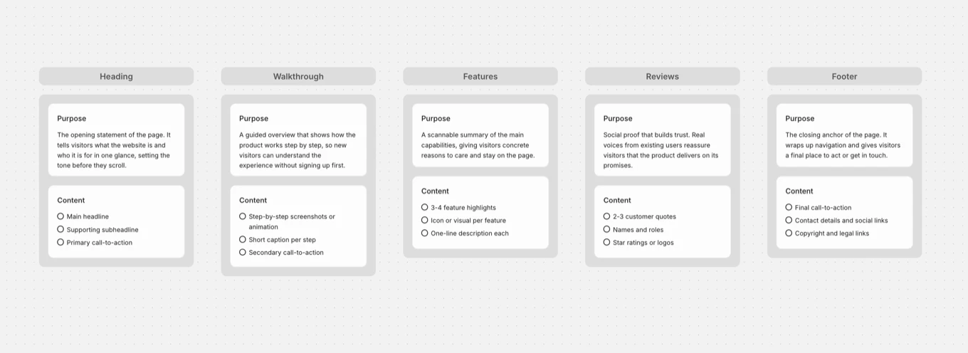
The architecture is a plan of every section on a certain. We defined each section by its job, its content, and the purpose it serves for the visitor.
For example, the header's job is to say in words what Causal is. Its content is the headline, the subheading, and a CTA button. Its purpose is to let visitors place Causal as a workspace. If that lands as something they need, they keep scrolling. The walkthrough comes next - its job is to show a real canvas with real content so the view understand how the product can be used.
A lot of people leave the content part till after they have created a wireframe or, even worse, they ask AI to do it as they go along. However, content generated by AI is easily recognizable and doesn't truly represent the vision for your product. Defining and writing down the content now means you don't have to worry about it later and for every part after this, you can focus purely on the design. Moreover, the content is the heart of your website. You want the reader to understand what it is that your product does. Everything else, including the animations, motion, and assets, will be based around the content. So get this out the way.
3. References
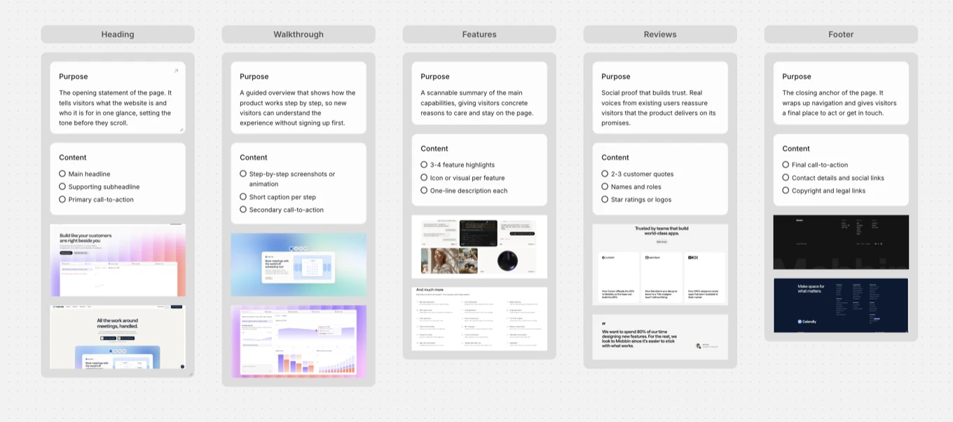
References are existing websites and interfaces, each tied to a specific section of the architecture.
Searching for inspiration with no constraints leads to a creative limbo of hours of scrolling and saving anything that looks good. By this point we already knew exactly what each section had to contain. So we weren't asking "what looks nice?" but "this section has to show five building blocks with a caption each, so who has solved that well?" That narrows the search to a handful of useful examples. It also means every reference has reason for being there, which matters later when someone else, or an agent, has to work out why a section looks the way it does.
4. Assets
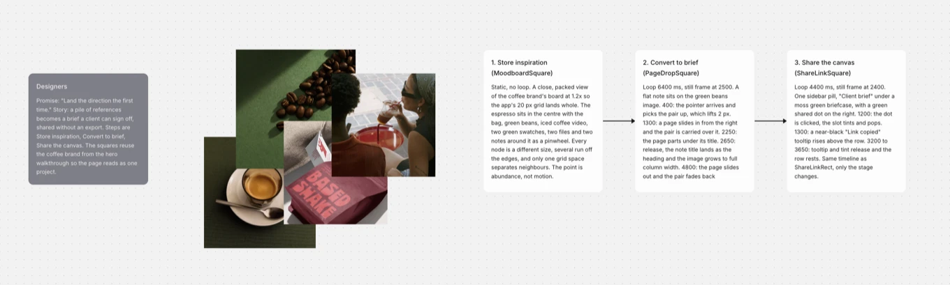
Our use case pages needed images, so we kept them on a moodboard canvas, separate from the references.
References tell you how a section should be laid out. Assets are what fills it. On a use case page like "Designers", the images have to look like they belong together. We put all our asset on one canvas so we could judge them as a set for colour consistency. Colour consistency on a website is rarely talked about but is an important tool for creating visual hierarchy.
Some of the assets needed to also be turned into animations. We created brief motion design plans using notes on the canvas and then handed them to Claude to turn into coded animations. Storing them in Causal had a second benefit: with Causal connected through MCP, the agent could open the moodboard and use the images directly, saving the manual time of exporting each picture.
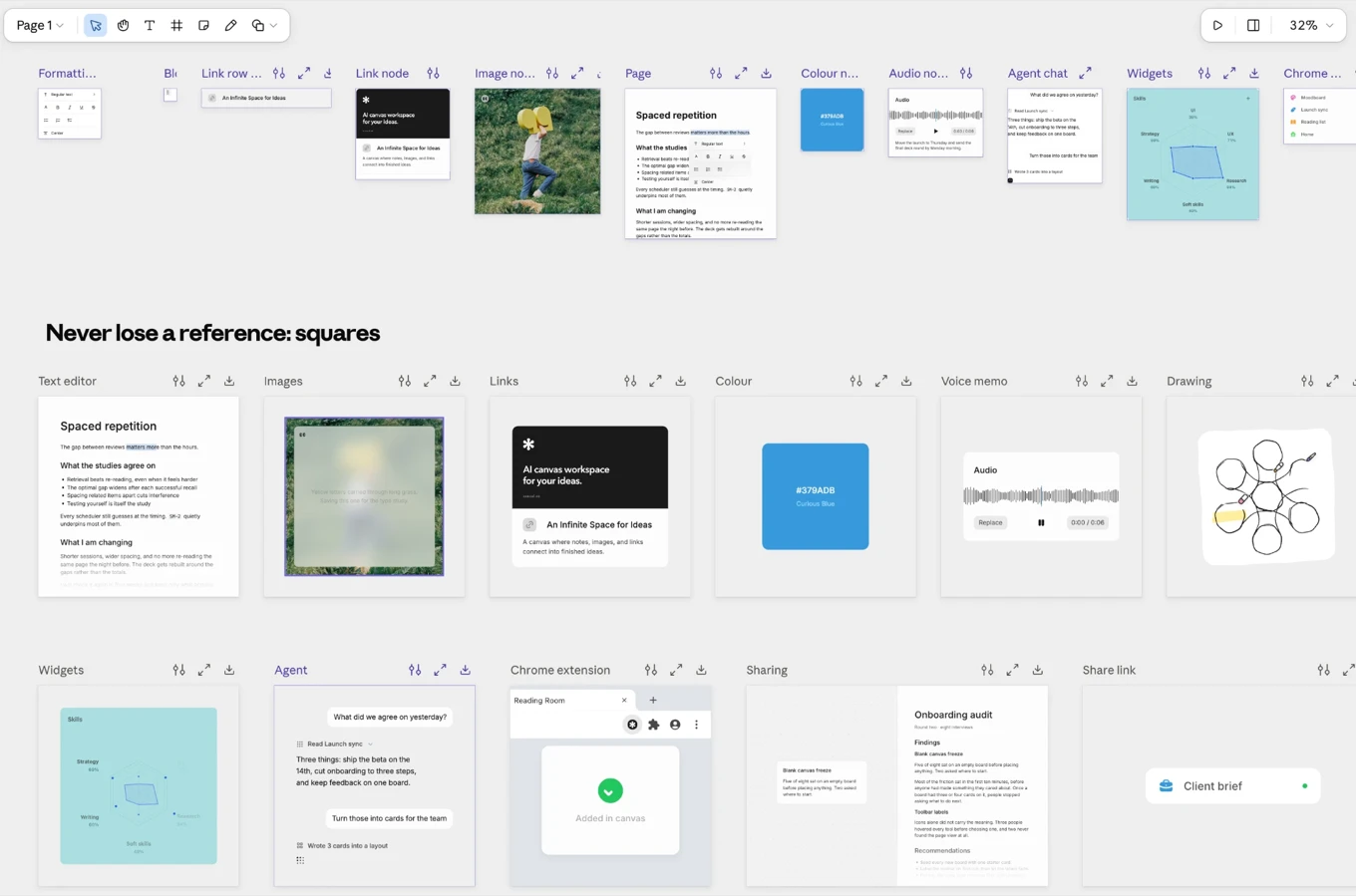
For the motion itself, we worked on a second board: Claude artifacts. Artifacts are powerful for design iteration and allows the agent to work in its native language. All the smoothness and coherency you see in the little animations across our website were planned on Causal and animated inside Claude artifacts.
5. The roadmap
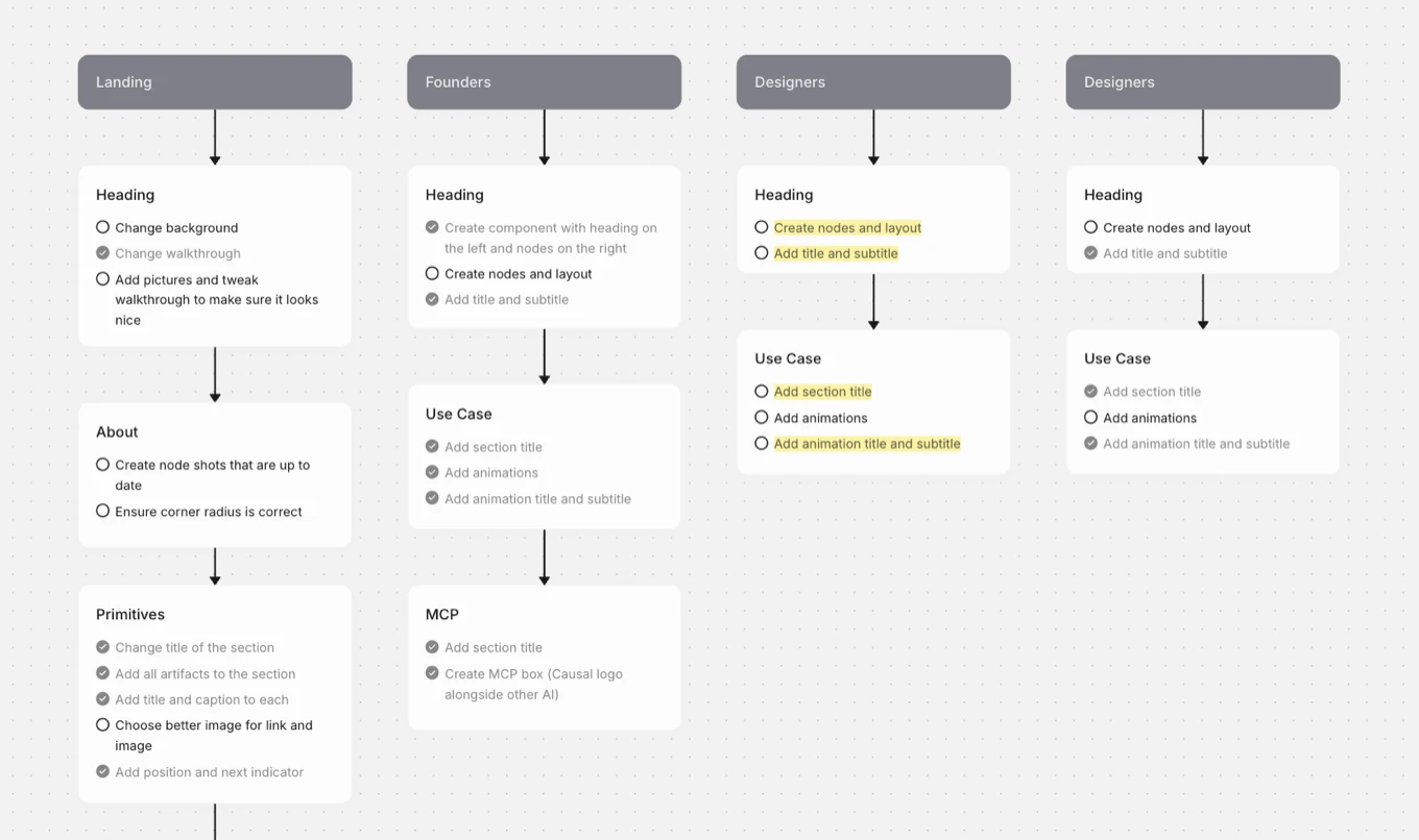
The roadmap breaks the build into pages, each page into sections, and each section into a to-do list. It defines what has to be completed per section and turns the plan into tasks to finish and check off. Having the project roadmap shared with the agent also ensured that everyone was on the same page.
Add one card per section from your architecture in scroll order. Give each card a checklist of specific tasks that can be marked done, and avoid vague ones like "improve".
6. The handoff
With the roadmap in place, we gave the build to Claude, with access to everything above.
This is where the earlier steps pay off. Through MCP, Claude could read the brief, the architecture, the references, the moodboard and the roadmap in one place. It had our decisions and the reasons behind them. It knew what each section was for, what it should look like, which images to use and what was left to do. AI-built websites go wrong because the agent has to guess at inspiration. Having everything defined meant there was no room for guessing.