Blog Guide
Product design

5 min read
You get three screens into the implementation and realise the second screen should not exist. You scrap the code and rebuild. That loop repeats every few weeks for a solo builder, consuming days of work that produce nothing new. It happens because the structural decisions that belong in a planning phase get pushed into code. You can eliminate most of those rebuilds by changing the sequence of your decisions.
The sequence design teams rely on is simple and established. They define the core problem first, map out the user flow second, construct a wireflow of page layouts and arrows third, and save high-fidelity visuals for the end. That structure prevents team friction, but it is even more effective for a solo builder working under time constraints. You can run that entire process in a single afternoon using text and arrows.
1. Start with the problem
Before you open a visual editor or request code from an assistant, write down the problem you are solving in one sentence. That sentence becomes the benchmark for every screen and interaction you build later. If a proposed screen cannot be traced directly back to that original statement, you drop it from the build. Writing the problem down forces you to clarify what you are trying to achieve before you spend energy on aesthetics.
Skipping this step guarantees scope creep. When you start with a vague idea of a feature, every edge case feels like a mandatory screen, and you end up building an overcomplicated solution. A clear problem statement is a filter that keeps the initial version small. The goal is to make the statement as simple as possible so that every subsequent step has a clear anchor.
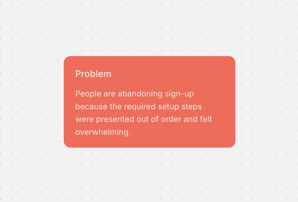
On Causal, we place that problem statement on the canvas as the very first card. It stays visible on the board while we arrange every other element around it. When we noticed people were dropping off during our own onboarding, we wrote a single problem card: people were abandoning sign-up because the required setup steps were presented out of order and felt overwhelming.
2. Break the problem into screens
List the screens your solution requires using plain text only. Write one or two sentences per screen to describe its purpose, and avoid opening any design software. Some screens carry the main utility of the feature, while others exist only to transition the user to the next step. Identifying those transition screens early allows you to evaluate whether they are necessary or if their function can be merged into another view.
This step is where you save the most time. Realising a screen is redundant costs five seconds when it is a line of text on a board, but it costs hours once you have written the component and routed the navigation in code. Most of the structural changes that normally force a rebuild after three days of development can happen right here in ten minutes.
3. Put the screens in order
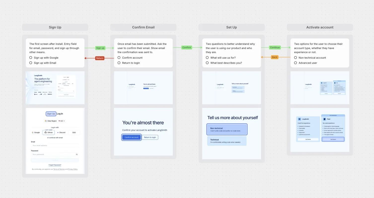
Arrange the screens in chronological order and draw arrows between them to show how a user moves through the experience. Seeing the entire sequence laid out spatially answers whether you are solving the problem in the direct path available. It shows awkward transitions and dead ends that are invisible when you think about screens as isolated units.
When you skip this step, you build screens as individual components and only discover the friction when you assemble them in code. Mapping the path first establishes the logic of the experience before you spend effort on visual details. The combination of simple page layouts and directional arrows forms a wireflow, which gives you a clear structural map of the feature.
4. Decide what goes on each screen
Define the specific actions and elements that belong on each screen. Identify the single primary action a user is meant to take on that screen, and then list any secondary actions below it. If you cannot immediately name the primary action for a screen, that screen has not been thought through and should either be redesigned or removed.
If you skip this step, you end up designing screens during implementation and adding buttons whenever you realise an action is missing. That leads to cluttered layouts where three different buttons compete for attention. Deciding on the hierarchy in advance ensures that every screen has a single clear purpose.
5. Look for inspiration last
Gather visual references only after your structure and screen requirements are locked in. Browsing for inspiration at the beginning of a project leads to copying entire flows from other apps, which imports their product problems and constraints into your project. When you search for references with a completed specification, you are looking for specific answers to predefined questions, which makes the search efficient.
Limit your search to narrow details like button treatments and card layouts. Mobbin is the recommended source for this step because it lets you view real production screens without forcing you to copy full user flows. Save references that genuinely differ from one another so you have actual structural choices to evaluate, rather than saving five variations of the same visual layout.
We drop reference screenshots from Mobbin directly onto the Causal canvas right next to the screen card they address.
6. Design to the spec, or hand it to an agent
By the end of this process, your feature is specified in words and arrows. You can open a design tool and execute the layouts directly against that specification, or you can supply the entire board to an AI agent to write the code. Because the structural thinking is already finished, the implementation step becomes a straightforward translation of the board into production assets.
If you use an agent, hand over the complete board rather than writing a new prompt from memory. Causal connects to Claude, ChatGPT, Cursor, and VS Code through MCP, allowing the agent to read the cards and arrows directly from the canvas. The planning board is both your thought process and the specification for the build.