Blog Guide
Vibe design

4 min read
I used to rush straight into gathering inspiration and sending it off to AI to code for me, and then wonder why:
- The website did not convey my start-up’s identity properly
- It looked like every other vibe-coded website
- I always got stuck in creative limbo
But even professional UI designers are starting to use AI as part of development. So the question worth asking is this: why doesn’t a professional designer’s website turn out as AI slop? As part of creating a tool for modern creatives, we wanted to better understand the most efficient process for building a website, from plan to design to development. I reached out to 17 professional web designers, and this is the order I settled on from those conversations.
1. Discovery
Interrogate the client (or yourself) and write down:
- What the product does in one sentence
- Who it’s for
- The emotion the visitor should leave with
- The one most important action
- What separates it from its competition
- Three adjectives to describe the brand
It is important that this stays under one page, so that you are setting a constraint on yourself. For me, the most important part is the set of adjectives you use to describe the brand, because every later decision gets filtered through them.
2. Content architecture
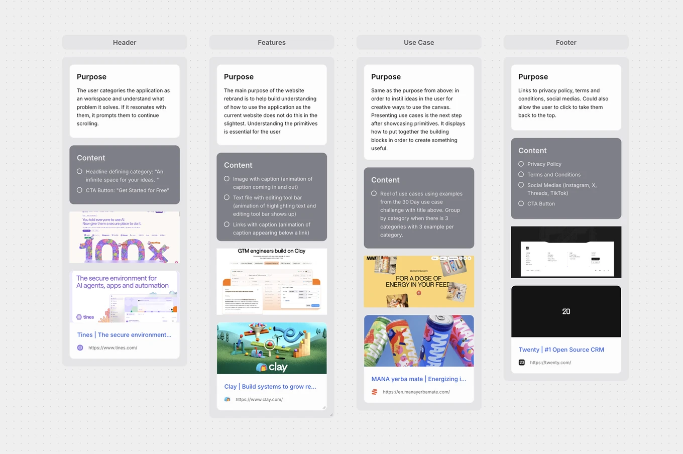
No visuals yet. Focus strictly on narrative structure. At its simplest, a website needs three things:
- Category - What kind of thing this is. The user files it against something they already have a model for, like a canvas, a whiteboard, or a document. It explains what problem it solves.
- Primitives - What it’s made of. Your building blocks. This is what lets someone generate their own use cases rather than only recognising the ones you show.
- Instance - Worked examples of primitives assembled into something real.
A fuller and more conventional structure follows a clear psychological flow:
- Hook: States the core value proposition immediately.
- Problem: Articulates the exact pain point the visitor is experiencing.
- Solution: Introduces the product as the direct fix to that pain.
- Proof: Validates claims using metrics, testimonials, or logos.
- Features: Explains key capabilities and mechanics.
- CTA: Prompts a single, unambiguous action.
Shift this sequence based on visitor awareness. For example, cold traffic needs the problem framed before it sees any features, whereas warm traffic needs proof and immediate access to the action.
3. Mood boarding
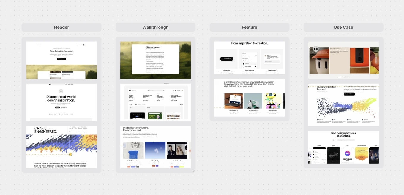
This is the only phase where you look at other work, and it must be strictly in reference to the brief you wrote in Phase 1.
Gather references across four distinct categories, pulling each one independently:
- Typography: Font pairings, weight hierarchy, and scale.
- Colour: Base palettes, accent tones, and contrast ratios.
- Imagery: Photography style, 3D assets, or illustration line weights.
- Motion: Micro-interactions, transition speeds, and scroll behaviours.
Justify every reference against the three brand adjectives from Phase 1. If an asset doesn’t map directly to an adjective, drop it. That is why I put the adjectives first: without them I would get stuck in creative limbo and lose hours scrolling through Mobbin or Minimal.
4. Visual design
Now you can open Figma. Lay down the typography, colour palettes, and spacing grids that you have already planned. Because you have mapped everything out, you are designing under a healthy constraint, and that is what stops you from getting stuck in creative limbo.
The visual assets and images come second to last, so that you do not depend on them to carry your website but use them to complement the text.
Annotate motion during this phase: write out behaviour specs using the comment feature in Figma, e.g. “Headline fades up on load” or “Cards stagger 50ms on scroll”.
5. Motion
Motion is like body language - it should complement what you are already saying. The basics of motion design:
- Hierarchy: What moves first is always what matters most.
- Easing: In the real world, nothing starts and stops at a constant speed. Animations should accelerate and decelerate to imitate real motion.
- Duration: The user should never have to wait for an animation to finish. Motion should always be “felt”.
- Choreography: Elements react to one another. For example, related items travel together.
Treat motion as a functional tool to guide spatial hierarchy and user attention. It should never be make-or-break for your website.
6. Development
Hand off design tokens, assets, and layout to Claude and build strictly to spec.